The Spring 2026 Color Trends That Make Everyday Outfits Feel Fresh
Introduction
Spring color trends don’t require a new wardrobe. A pale blue shirt can lighten a familiar coat, a butter-yellow knit can brighten a simple outfit, and jeans can anchor a fresh mix of colors. These spring color trends are easy to try with pieces you already own.
For 2026, the palette is about contrast, not one must-have shade. Pistachio, powder blue and lilac offer a quiet reset, while tomato red and vivid green add definition. These 2026 fashion colors make room for both subtle updates and bolder choices.
These colors work beyond editorial styling. Wear them in small doses, repeat them across different pieces and adapt them to your existing wardrobe. The aim is to change how colors work together, not replace everything at once.
Palette analysis: the leading players
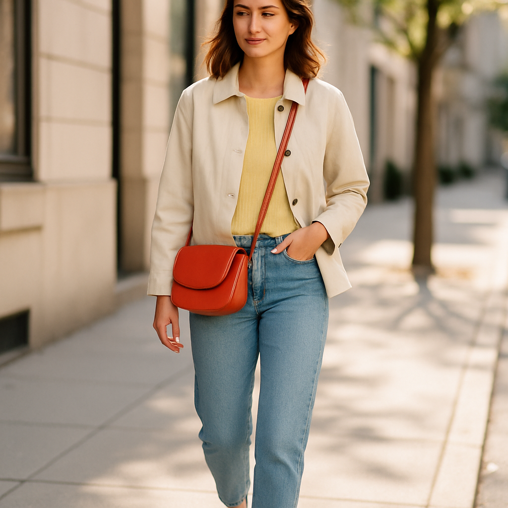
Butter yellow sits between neutral and statement. It has the warmth of a cream knit but more presence, making it a good choice for a cardigan, shirt or lightweight jacket. Against navy, denim or charcoal, it feels considered without looking too sweet. It’s one of the spring color trends that can work as either an accent or a wardrobe staple.
Powder blue cools warm neutrals and softens dark tailoring, while still holding its own. A blue shirt with brown trousers, for example, feels more relaxed than white and brown but remains easy to wear.
Pistachio and soft green tie a palette together. They work with beige, white and blue, making them useful when an outfit already includes several colors. Choose a green with a hint of gray or yellow so it sits comfortably with the rest of your wardrobe.
Lilac works best when texture and proportion keep it grounded. A fine knit or crisp cotton shirt feels clean; a full outfit in floaty fabrics can look costume-like. Pair lilac with denim, stone or deep brown for more balance.
Tomato red makes a direct statement, but it doesn’t need much space. A bag, shoe or top can lift an outfit built around neutrals. Vivid green has a similar impact but can be harder to pair with other strong colors. Give either shade room, and keep the rest simple. These spring color trends feel most wearable when each shade has a clear role.
Key factors
Start with proportion. A strong color usually looks more modern in one clear area than in several competing accents. A red top with blue jeans has a clear focal point; adding a red bag, green shoes and a patterned scarf can muddy the look.
Color temperature matters, too. Butter yellow and tomato red tend to work naturally with cream, tan and chocolate brown. Lilac and powder blue often pair more easily with gray, navy and white. These are useful starting points, not hard rules. For practical color pairing tips, begin with one shade you like and build around its undertones.
Texture can change a color’s effect. Butter yellow in brushed knitwear feels gentle; in a crisp shirt, it looks sharper. Satin reflects light and intensifies color, while cotton and denim tend to make it more casual. If a shade feels too loud, try it in a different fabric. That flexibility is part of what makes spring color trends useful in a real wardrobe.
Think about how often you’ll wear the color. It becomes part of everyday style when it works in several outfits, not just one carefully assembled look. Repeating a shade in a top and a small accessory can bring a wardrobe together, but the pieces don’t need to match exactly. For everyday spring style, choose colors that fit your routine as well as your taste.
For pastel outfit ideas, pair one pale color with a grounded neutral. Try pistachio with dark denim, lilac with brown or powder blue with charcoal. The neutral balances the pastel, while the softer shade keeps a familiar base from feeling routine.
Bright spring outfits benefit from the same restraint. Choose one lead color, then balance it with denim, white, navy or tan. A tomato-red shirt with straight-leg jeans can feel more energetic than a complex color-blocked look, especially with a simple silhouette and a comfortable fit. This approach makes spring color trends easier to wear beyond a special occasion.
Good color pairing is less about fixed formulas than managing contrast. Two shades of similar intensity can look harmonious; a pale color beside a saturated one creates a focal point. If a combination feels off, simplify the rest of the outfit before giving up on the colors.
The outfit scenario
Imagine a weekday that starts cool and ends in mild sun. Dark jeans, a light neutral layer and comfortable shoes make a practical base. Add a butter-yellow knit or powder-blue shirt, and the outfit adapts to the weather without a full change. It’s a simple way to bring spring color trends into a regular weekday rotation.
For more impact, swap the pale top for tomato red and keep the other pieces quiet. A small green accessory can work if it has a clear purpose and doesn’t create a second focal point. Color can change the mood of a familiar outfit without changing its basic formula.
For a more polished look, wear lilac or pistachio under a brown jacket. The darker layer gives the palette structure, while the softer color keeps it from feeling heavy. Spring dressing doesn’t mean giving up the clothes that worked through winter.
Use this as a test, not a prescription: does the color work with your existing shoes, outerwear and routine? Shades that do are the ones most likely to earn repeated wear.
Conclusion
Spring 2026’s strongest color trends offer options rather than a uniform look. Butter yellow, powder blue, pistachio, lilac and tomato red each bring a different kind of freshness, but none needs to dominate an outfit. Taken together, these spring color trends offer plenty of ways to refresh familiar clothes.
Start with the colors you already wear, add one new shade and consider proportion, texture and contrast. A seasonal palette is most useful not as a set of rules, but as a way to see new possibilities in everyday clothes.